Platform Widget System
Cadentia
I designed the widget system for Cadentia's platform, working across vertical products, mobile and desktop, as well as the employee-side configuration experience.
Details
- Year
- 2025–2026
- Role
- UX/UI Designer
- Services
- Concept Design, UX/UI Design
- Website
- cadentia.ai
The Problem
My first project at Cadentia was to design platform-level widgets that every vertical product would reuse, on both mobile and desktop. I also designed how these widgets are configured on the platform side. It had to work for every vertical and every screen size, without a design system to lean on.
Approach
Internal systems work, so I grounded it in competitive research. I studied products with similar experiences (WhatsApp, survey and questionnaire tools, conversational AI platforms), mapped the requirements, and kept only the ideas that scaled across verticals and screen sizes. For configuration, I built on the existing panel, identified its usability issues, and studied well-functioning configuration tools such as Figma. Design-team reviews drove the iteration.
Key Decisions
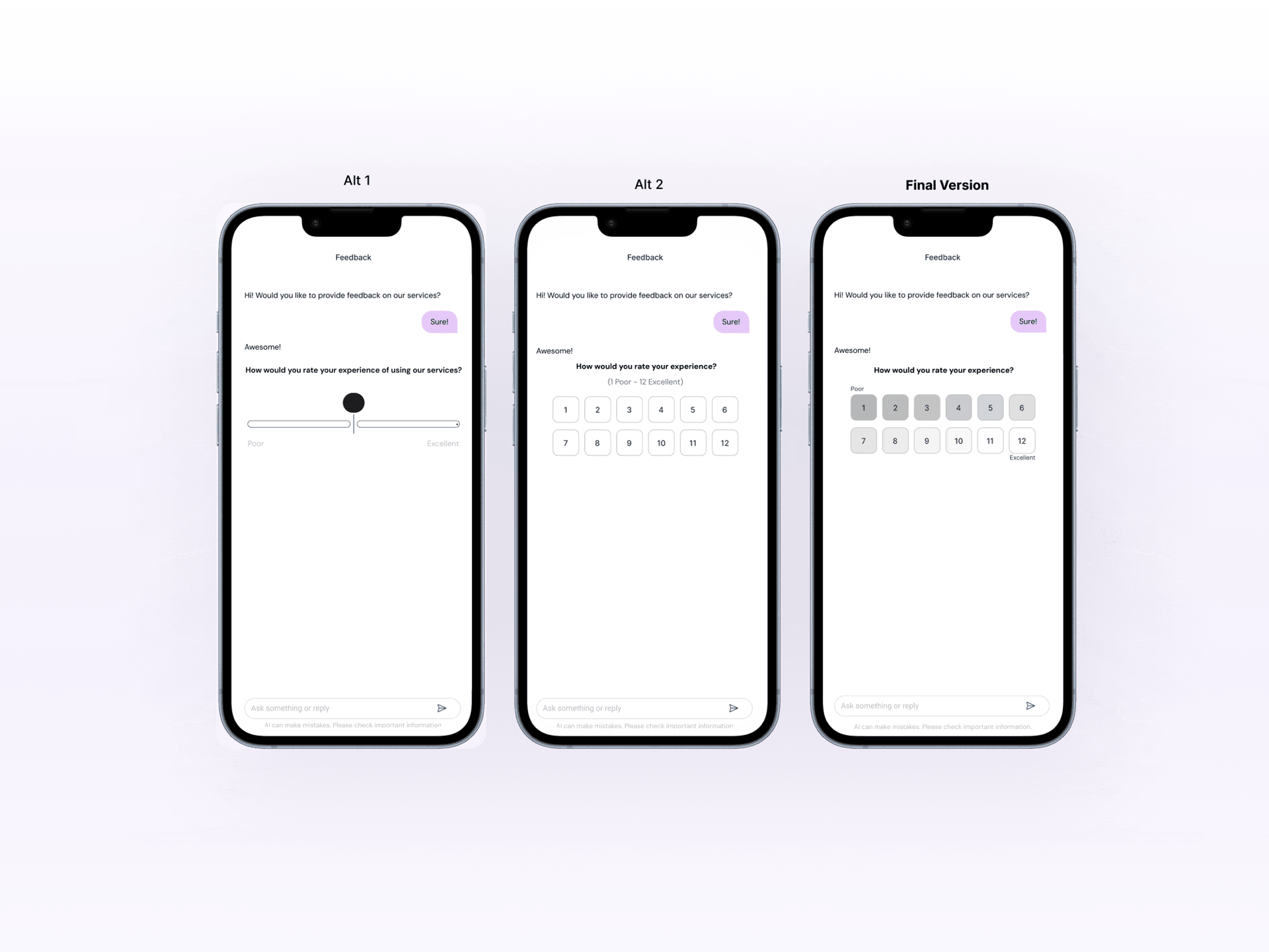
The rating scale
The 1 to 10 numbers needed two rows on mobile to meet accessibility standards, with no clear hierarchy or meaning. I explored a sliding scale but rejected it, since the initial position anchors people's answers (anchoring bias), risking biased data. I resolved it with a gradient across the numbers plus descriptive wording at each end of the scale.
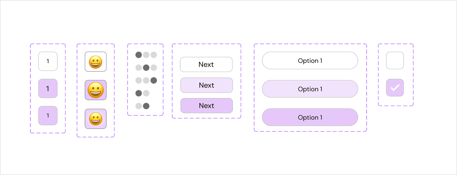
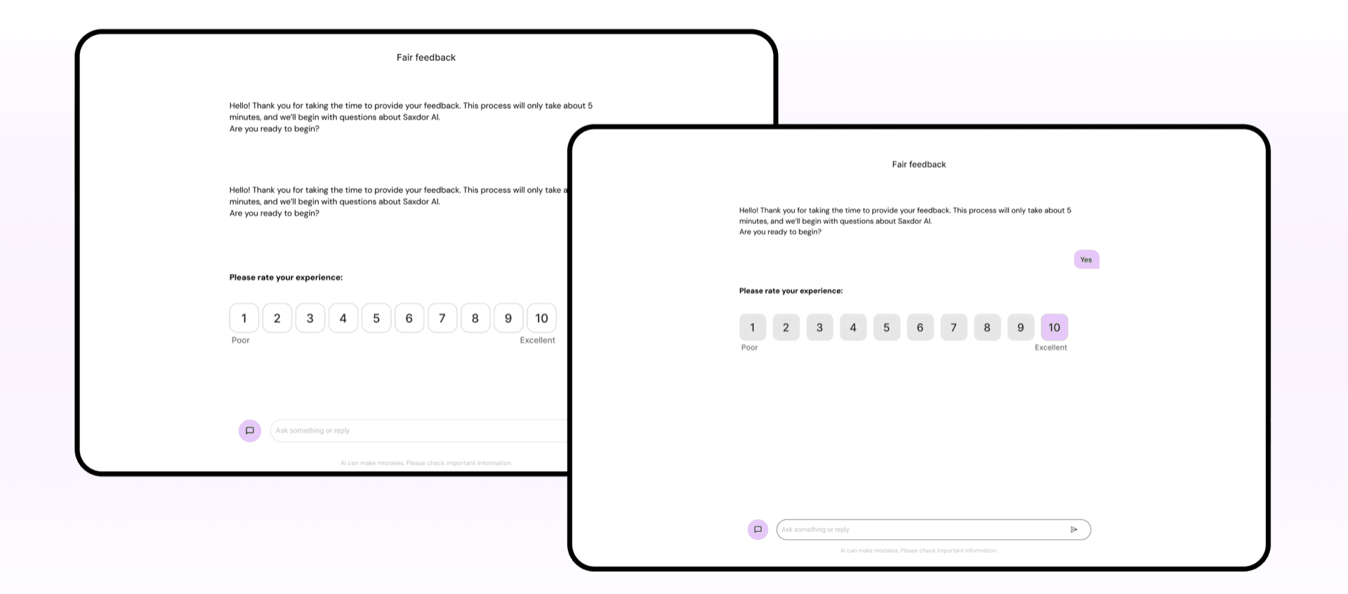
Designing states for trust
Answers could not be changed later, and users needed visible confirmation that the AI had recorded their input. I designed each widget's full state set, built so they could later slot into the design system we didn't yet have.
Redesigning the configuration panel
I was asked to implement the configuration as given, but I noticed several usability issues, so I proposed and designed a redesign instead. It was implemented, and team members reported it noticeably faster for building customer journeys.
Outcome
The widgets became the platform standard, reused across verticals and holding up across very different cases. The redesigned configuration panel sped up how the team built new customer journeys.
Reflection
Designing once for every context taught me the real differences between mobile and desktop, the animations and the constraints, and to test designs systematically across contexts. It also showed me how much consistent feedback and collaboration improve a solution.